The short answer, in weeks
Nobody wants a lecture when they ask how long an app takes, so here are the three honest ranges before anything else. A small app of five to eight screens, one kind of user signing in and no payments, takes five to eight weeks. A standard business app with customer accounts, card payment, push notifications and an admin dashboard your staff use to run it takes twelve to sixteen weeks. A multi role platform with several types of user, live tracking on a map, chat inside the app and connections to other companies' systems takes six to nine months, and no amount of goodwill squeezes that into a quarter.
What sets the number is the scope, meaning the list of screens and rules that must exist before anyone can download the thing, and not how hard the team works. Software of this kind is mostly sequential, because a screen cannot be tested before it is built and cannot be built before somebody has decided what goes on it, so adding people to a late project buys far less time than owners hope. That leaves one honest lever: change what is inside the app and the date moves with it, or leave the list alone and accept the date that comes with it.
Almost every client who arrives saying "it is only a simple app" is describing the middle tier without knowing it, because the moment the words accounts, payments and notifications appear in the same sentence you have named three separate pieces of work, each with its own screens, its own testing and its own ways of going wrong:
- Accounts mean sign up, sign in, password reset, profile editing and a way for someone to delete the account entirely.
- Payments mean a merchant account, which is the arrangement with a bank or payment company that lets you take card money at all, plus a rehearsal mode and a real money mode, receipts and refunds.
- Notifications mean the permission prompt a user sees, the wording of the messages themselves, and a place in your dashboard to send them from.
That is three features wearing one word, and pricing them as one word is where a great many cheerful quotes come from.
There is one assumption sitting under every range above, and it is the assumption that fails most often: decisions arrive on time. A question sent on a Tuesday and answered three weeks later has added three weeks to your launch, whether or not anybody meant to, so the rest of this article is largely about where those weeks actually go and what each one costs you.
What counts as a small, a standard, and a large app
You can size your own idea in about ten minutes with three counts, and none of them require any technical knowledge at all.
- Count the screens. A screen is anything a user looks at as a distinct page: the home screen, the search results, one product, the basket, the confirmation. Five to eight is small, roughly fifteen to twenty five is standard, and past about thirty five you are building a platform.
- Count the types of user who log in. One type is small. Two, say a customer and a member of staff, is standard. Three or more, say a customer, a driver and a branch manager, means every rule has to be written three times over.
- Count the outside systems you must connect to. A payment provider, an SMS gateway, an accounting package, a delivery company, an existing database in your office. Each one is a negotiation with somebody else's software, and each usually costs three to five working days on its own.
Here is how that arithmetic plays out on a real request. A clinic asks for "a simple booking app", and on the patient side it needs a welcome screen, sign up, sign in, password reset, a list of doctors, a doctor profile, a calendar of free slots, a booking confirmation, my appointments, a cancel or reschedule flow and a profile page. That is eleven before the clinic itself has seen anything. The doctor side adds a day view, an appointment detail, a way to block out leave and a screen showing patient notes. Add reminder messages and card payment and you land at eighteen to twenty two screens across two roles, which is a standard app of twelve to sixteen weeks, however simple it sounded said aloud in a single sentence.
The piece owners forget almost every time is the admin dashboard, the private website where staff add doctors, change prices, refund a payment and read the day's bookings. It has its own screens, its own permissions and its own testing, so it is genuinely a second product hiding inside the first, and it typically adds two to three weeks to the calendar. That is why our mobile app development service quotes the iPhone app, the Android app, the dashboard and the store submission as one package, since quoting only the phone half produces a number that cannot possibly be delivered.
The five stages of a build, and what each one really costs in time
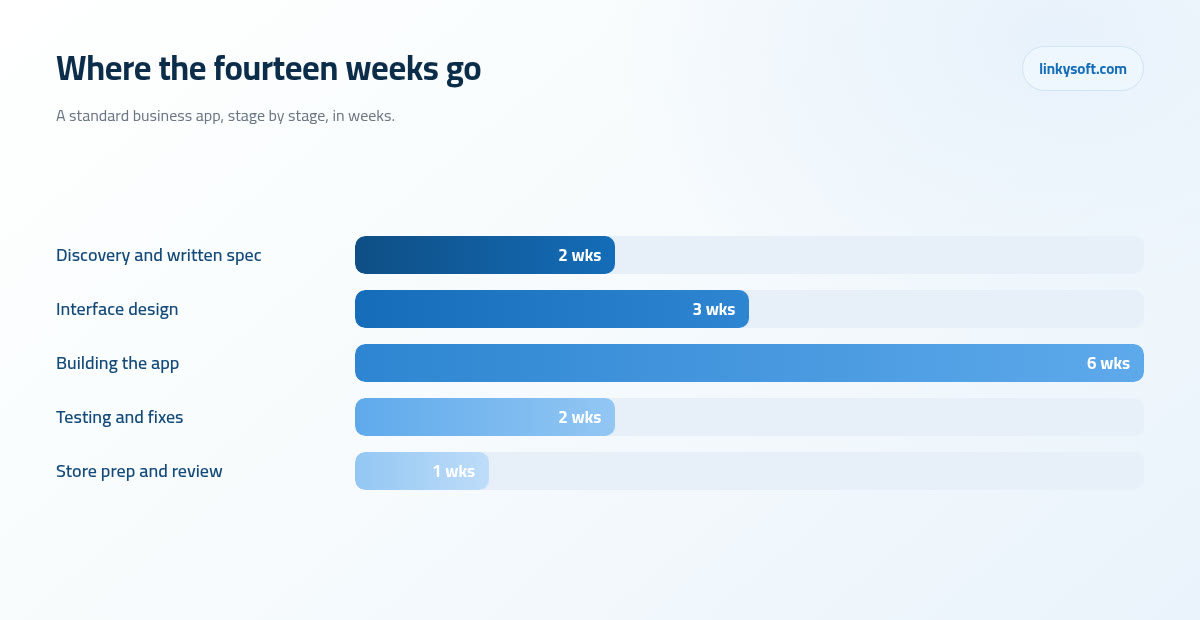
Every project we run passes through the same five stages, and it helps enormously to see them with weeks attached rather than as vague phases. A standard fourteen week project divides up like this: two weeks of discovery and a written specification, three weeks of interface design, six weeks of building the app itself, two weeks of testing and fixing, and one last week to prepare the store listings and get through review. Added together those give you the fourteen weeks that sit neatly in the middle of the standard range.
Discovery is the stage people are tempted to skip, and it is the one that pays for itself several times over. In those two weeks every screen is listed, every rule is written in plain sentences and every awkward question is answered while it is still cheap: what happens when a patient cancels an hour before the appointment, who gets the refund, does the doctor see the phone number, what does the app show when there is no internet. Answering that in week two costs a conversation. Discovering it in week nine, when the screens around it are already built and tested, costs roughly five times as much, because the fix ripples outward through everything that touches it.
Design finishing before the build starts is the other thing that quietly protects your date. A designer changing a drawing is an afternoon's work, while a developer changing the same screen after it has been built, wired up to the server, meaning the computer in a data centre that stores your information and answers the app, and then tested, costs around three times that, since the change has to be made, retested and checked against every screen it sits between. Which is why we ask clients to look hard at the designs and say what they dislike then, however uncomfortable that conversation feels, rather than politely approving something they are not sure about.
Where the hours actually go, and why building is under half the job
If you took all the effort in a standard project and split it into a hundred parts, roughly forty five of them are writing the app itself, eighteen are testing and fixing, fifteen are design, twelve are connecting to outside systems such as a payment provider or a delivery service, and ten are store compliance and the submission paperwork. The useful thing about that breakdown is what it tells you about quotes: anyone pricing only the build is pricing well under half the work, and the missing half is exactly where projects usually run late.
Testing deserves a plain explanation, because it sounds like a formality and is not. The same app has to behave correctly on a four year old Android phone with a cracked screen, a small display and an older version of the operating system, and equally on the newest iPhone with a much bigger screen, and on everything in between. That is dozens of combinations of device size, operating system version and network speed, and each one can produce a different bug: a button that falls off the bottom of a short screen, a keyboard that covers the field you are typing into, an upload that fails on a weak connection. Two weeks of testing on real hardware is what turns a demo into something you can hand to the public.
Cutting those weeks is the most expensive saving in the whole project. An app that crashes in its first week collects one star reviews that sit at the top of your store page for months, and those reviews suppress downloads long after the bug is fixed, so the fortnight you saved is repaid with refunds, support calls and a damaged listing. We would rather push a launch by ten days than ship something that greets your first hundred customers with a crash.
What Apple and Google require before they will publish anything
This is the part almost no timeline includes, and it is the part that most often turns a finished app into an unlaunched one. Start with the two accounts, because they take real calendar time. Apple's Developer Program costs 99 US dollars a year, and a Google Play Console account is a single 25 US dollar registration. Both should be opened in the company's name rather than a staff member's personal name, since an account in an employee's name walks out of the door with the employee, and moving an app between accounts afterwards is slow and painful.
A company account also needs a D-U-N-S number, which is simply a free business identity number used to confirm your company exists and that the person applying can act for it. Getting one, plus the document checks that follow, typically takes three to fourteen days. None of that requires a single line of code, so it can and should be started on day one of the project while design is still being drawn.
Then there is the paperwork both stores insist on before they will accept a submission:
- A privacy policy published as a working page on your own website, not a file attached to an email.
- A completed data and privacy questionnaire declaring what the app collects, which must match what the app truly does, since answering it optimistically is a rejection and, later, a much bigger problem.
- An age rating, produced by answering a content questionnaire honestly.
- A support contact, meaning a real email address or page where a user can reach a human being.
Two rules catch people out with impressive regularity. If users can create an account inside your app, both stores require a way to delete that account from inside the app as well, and pointing at a support email does not satisfy it. And if you offer sign in through Google or Facebook, Apple generally requires you to offer its own sign in option alongside them. Both of those are small pieces of work when planned in discovery and genuinely annoying ones when discovered the week you meant to launch.
There is also a European requirement worth knowing before it bites: if you distribute in the European Union you must declare and publish trader contact details, meaning a real company name, address, phone number and email shown on your store page. Skip it and the app is simply hidden from European storefronts, which is a quiet failure rather than a loud one, and easy to miss until somebody in Berlin says they cannot find you. When we answer the privacy questionnaire with a client, we walk through what the app actually stores and where, which is the same conversation we have on any cybersecurity review, because the honest answer and the safe answer are usually the same answer.
The store listing itself, which is a piece of work nobody budgets for
Your store page is a shop window, and it needs assets that have to be made rather than found. You will need a square app icon at 1024 pixels, screenshots for each phone and tablet size the stores require with up to ten per size, a 1024 by 500 feature graphic for Google Play, which is the wide banner image sitting across the top of your store page, a short description of about 80 characters and a long description of up to 4000, plus that privacy policy hosted on your own site.
Written and shot properly, that is three to five working days of work, and a good part of it is yours rather than ours, because the words that sell the app are the words you use with your customers every day. The screenshots are not just pictures of the app either. They are chosen to show the three things a stranger needs to see in the four seconds they spend deciding, usually with a short line of text over each, so leaving the whole listing to the last Friday before submission is how a strong app ends up with a weak shop window.
One small item causes an outsized share of rejections: the reviewer test account. If your app has a login, you must hand Apple and Google working credentials so a human reviewer can get past the sign in screen, and an account that is missing, expired, locked or pointing at a server you have since switched off means an automatic rejection with days lost. At Linkysoft we keep a dedicated review account with realistic data already inside it, and we check that it still signs in on the morning of every submission.
The reassuring part is that store text and screenshots can be edited after launch at any time, so your launch listing has to be good rather than perfect. Get the icon, the first two screenshots and the short description right, publish, then improve the rest once you can see which words actually bring installs.
How long the review takes, and why apps get rejected
Once you press submit, the practical timings look like this. Most Apple submissions come back within twenty four to forty eight hours, but a brand new app on a brand new account often takes two to five days because it gets a closer look. A first Google Play release from a new account can take up to seven days, while later updates on an established account usually clear in hours. Plan the launch date with the slow version of those numbers, then enjoy being early.
There is one rule that surprises almost everybody. A newly opened personal Google Play account normally has to run a closed test first, with at least 12 testers opted in continuously for 14 days, before it is allowed to publish publicly. That is a fortnight that appears in no build schedule, and it requires you to actually find twelve real people with Google accounts and keep them enrolled throughout. If you are launching under a company account this generally does not apply, which is one more reason to sort the accounts out in week one rather than week twelve.
Now the honest part. In our experience roughly one first submission in three comes back with at least one note from the reviewer, and that is normal rather than a disaster. The fix and resubmit loop is usually two to five days in total, so a single note costs days rather than weeks provided somebody is available to answer it. The usual causes are short and repetitive:
- The app crashed on the reviewer's device, often an older or a very new model nobody tested on.
- The test account was missing, expired or did not work.
- The privacy answers did not match what the app actually does.
- There was no way for a user to delete their account from inside the app.
- Digital content was being charged for outside the store's own payment system, which both stores treat firmly.
The delays we see most often, and what each one costs you
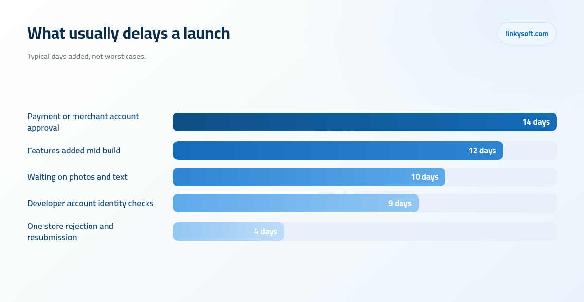
Approval of the merchant account and of the payment gateway, the gateway being the company that carries card details safely from your app to the bank, is the biggest single delay at around fourteen days, because a bank or payment provider is checking your company documents on their own schedule and nobody in the project can hurry them. Late scope additions cost about twelve days, since features agreed after design is finished have to be drawn, built, tested and then checked against the screens around them. Waiting on photos, product descriptions and legal text costs about ten days, which is painful precisely because the work is sitting with the client. Developer account and identity checks add around nine, and a single store rejection with its resubmission adds about four.
It helps to do the arithmetic out loud, because the cost of waiting is invisible in a way that the cost of building is not. A three person team held up for one week is fifteen working days of paid capacity spent producing nothing at all, and that is what an unanswered question really costs. It is why we chase a decision that has been outstanding for two days rather than four, and why we ask at the start for one named person who can settle a question inside a day without convening a committee.
Late additions compound in a way that is easy to miss. Every "quick extra feature" during the build costs roughly one and a half to three working days once the design, the coding, the testing and the re checking of the screens around it are all counted, so five quick additions quietly cost you a fortnight. None of them felt like a delay when it was requested, which is exactly the problem. The fix is not to refuse every change, because good ideas do appear mid build, but to price each one in days out loud at the moment it is asked for so the choice is made with open eyes.
One codebase or two, and what that choice does to your date
You will hear the phrase cross platform, and in plain words it means writing one set of code that produces both the iPhone app and the Android app, instead of building each one separately from scratch. Compared with two separate native builds it typically saves twenty five to thirty five percent of the build weeks, and since the build is six of the fourteen weeks in the standard project above, that comes to roughly one and a half to two weeks off the calendar, along with the same share of what those build weeks cost. The saving keeps paying out afterwards as well, because every later fix is written once instead of twice.
Native, meaning a separate app written specifically for each phone, is genuinely worth the extra time in a few cases: heavy camera or video processing, continuous location tracking that must keep running while the phone is in a pocket, deep use of hardware features, or a game. If your app is one of those, we will say so and quote the longer route, because the wrong choice there produces an app that works badly on the phones it was compromised for.
For the vast majority of what businesses actually ask for, which is booking, ordering, membership, delivery, loyalty and internal tools for staff, cross platform is the right answer and we will tell you that rather than selling the longer route. Linkysoft has no interest in charging you for six extra weeks that produce nothing your customers will ever notice. One caveat worth stating plainly: every store requirement in this article is identical whichever way you build, so the technology choice shortens the build and shortens nothing at all in the compliance and submission work.
When a smaller launch is genuinely the better decision
Sometimes the honest advice is that you do not need an app yet. If what you are building mainly shows information and takes a booking or an enquiry, a fast mobile friendly website reaches every phone on earth within days, needs no store approval, no developer accounts, no review queue and no annual maintenance to keep it installable, and it can be changed on a Tuesday afternoon without anybody's permission. Our web design and development work exists partly for this reason, because a good mobile site answers the real question for a large share of the businesses that come to us asking for an app.
Where an app is genuinely right, the smaller launch is still often the better first move. Cutting a first release from twenty two screens to nine, and shipping it in seven weeks instead of fifteen, gets a working product into real hands two months earlier and costs a fraction of the full build. The nine screens are the ones without which the app is pointless, and everything else waits.
The practical benefit is not just the earlier date, it is what you learn. Once real users are inside, you can see which parts they touch and which they ignore, and it is common to discover that the feature everyone argued about for a week is barely opened, while something nobody discussed at all turns out to be the reason people come back. Building phase two from that evidence is cheaper and more accurate than building it from a meeting, and you can see how that pattern plays out across the projects in our case studies.
What you can start today to protect your launch date
None of the following needs a developer, and all of it runs in parallel with the build, which is why it is the cheapest time you will ever buy.
- Open both store accounts in the company name now. Apple's programme and the Google Play registration both involve verification, and starting them in week one keeps those three to fourteen days off the critical path, which is simply the chain of tasks that decides your finish date.
- Publish a privacy policy and a support page on your website. Both stores check that the links work, and a page that goes live on submission day is a page nobody has proofread.
- Appoint one person who can decide within a day. Not a committee, one named person with the authority to approve a design or settle a rule, because this single choice saves more days than any technical decision in the project.
- Gather the content early. Real photographs rather than placeholders, real product or service descriptions, and the exact wording of prices, terms, cancellation rules and refunds, since every one of those has to be written by somebody who knows your business.
- Start the payment and bank paperwork in week one. Merchant approval sits outside everyone's control and commonly takes one to three weeks, so it should be running while the first screens are still being drawn.
Every one of those five runs on somebody else's clock rather than ours, so starting them in week one means they finish quietly while the app is still being drawn and built. None of that work gets any shorter for being started early, it simply stops being the last thing standing between a finished app and its launch.
After launch: the first ninety days and the yearly deadlines
Expect two to four small updates in the first month, and read that as a healthy launch rather than a broken one. Real users do things no test team thinks of, on phones no test lab owns, with names and addresses and photographs that break assumptions, so the first few updates are simply your app meeting reality. What matters is that the team is still there to ship them quickly.
After that there is an annual rhythm to plan around. New phone software arrives each autumn from both Apple and Google, and each year both stores raise the minimum version an app must be built against in order to be updated at all. An app left completely untouched for a year or two therefore reaches a point where a small change is no longer a small change, because the tools it was built with are too old to submit with and part of it has to be reworked before anything can be published. That is entirely avoidable with modest, regular attention.
The budgeting rule of thumb we give clients is to set aside roughly 15 to 20 percent of the build cost per year for maintenance, hosting, the store fees and small improvements. On a fourteen week standard build that is not a large number, and it is what keeps the app installable, secure and worth having on somebody's home screen three years from now.
If you have an idea and want a realistic date for it rather than a comfortable one, send us the rough list of what it must do and who logs in, and we will map it to weeks, name the store requirements it will trigger and tell you honestly if a smaller first release or a mobile website would serve you better. That is the conversation Linkysoft would rather have at the start than in month four, and you can begin it on our contact page.