Responsive Design: Why It Is a Necessity, Not a Luxury
Most of your visitors are on phones. A site that breaks on small screens loses them — and loses ranking too.
1 minute read
15 articles
Most of your visitors are on phones. A site that breaks on small screens loses them — and loses ranking too.
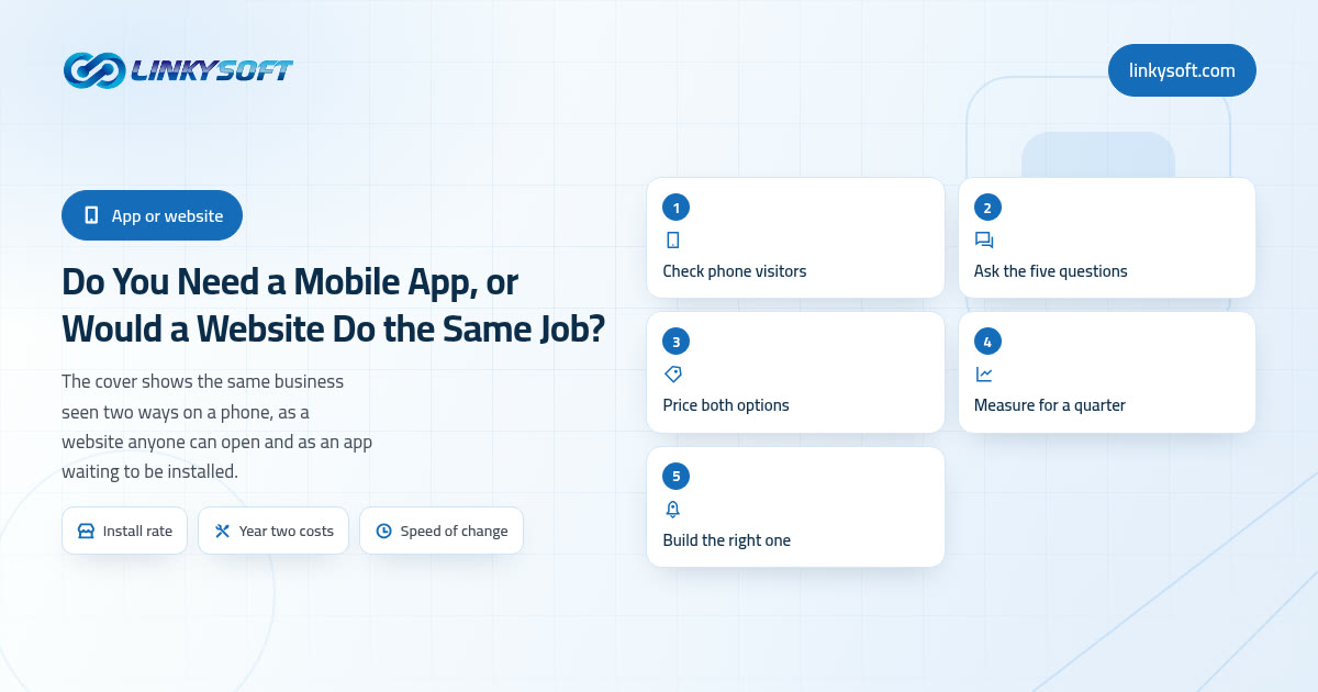
Most owners asking this have already been sold the answer, so here is ours before the detail: about eight in ten businesses need a phone friendly website first and an app later or never. This article settles it with three numbers rather than another feature list, covering how many people really install, what the build and the years after it cost, and how often one customer would open it.
In today's digital landscape, e-commerce is not just a luxury for businesses; it’s a necessity. The rapid shift towards online shopping has made it critical for businesses to develop strong, responsive online stores that cater to users across all devices. Whether a customer is browsing your store from a desktop computer, tablet, or smartphone, their experience must be seamless and enjoyable. Having a responsive design is one of the key components to achieving this. This article will delve into
In the fast-paced world of web development, creating responsive and user-friendly websites is essential for engaging users and ensuring a seamless experience across all devices. Bootstrap, one of the most popular front-end frameworks, provides developers with the tools and components needed to build responsive websites quickly and efficiently.
Designing user interfaces using Bootstrap is a crucial skill in modern web development. Bootstrap, developed by Twitter, has become one of the most popular frameworks for building responsive and mobile-first websites. With its ease of use, extensive library of components, and strong community support, Bootstrap is the go-to choice for developers worldwide. In this article, we will explore how to leverage Bootstrap to create visually appealing and highly functional user interfaces, ensuring a
In the dynamic world of web development, creating visually appealing and well-structured websites is paramount. Bootstrap, as one of the most widely used front-end frameworks, offers a powerful toolkit that simplifies the process of formatting sections and elements. By leveraging Bootstrap’s extensive range of utilities, developers can ensure that their web projects are not only aesthetically pleasing but also highly responsive and accessible across various devices. This comprehensive guide
Controlling margins and padding is a fundamental aspect of web design, influencing the spacing and layout of elements within a webpage. Bootstrap, a robust front-end framework, simplifies this process by providing a set of utility classes that allow developers to manage margins and padding with ease. This enables precise control over the spacing between elements, contributing to a well-organized and visually appealing layout.
Creating responsive and attractive web forms is a crucial aspect of modern web design. Bootstrap, an open-source framework, simplifies the process of adding text boxes and input forms, offering developers and designers a powerful toolset to build user-friendly interfaces quickly and efficiently. This comprehensive guide will explore how to effectively use Bootstrap to create text boxes and input forms that not only look great but also enhance the user experience.
Bootstrap, a powerful and versatile front-end framework, has become an essential tool for web developers worldwide. Its primary appeal lies in its ability to streamline the development process, enabling the creation of responsive and aesthetically pleasing websites with minimal effort. However, to truly harness the potential of Bootstrap, developers must adhere to a set of best practices that ensure both efficiency and quality in their projects. This comprehensive guide will walk you through
Mastering the art of Formatting Images Using CSS is a vital skill for any web developer. It allows you to enhance the visual appeal of your website while ensuring it remains responsive and professional. Whether you are a beginner or an experienced developer, understanding how to effectively format images using CSS will significantly impact your website’s aesthetics and user experience. In this comprehensive guide, we will explore a variety of techniques, best practices, and advanced methods to
CSS (Cascading Style Sheets) has revolutionized the way web pages are designed and maintained. From simple text styling to complex layouts, CSS is the backbone of web design. As the web continues to evolve, so too do the tools and techniques available to developers. Among the most powerful tools introduced in recent years are CSS variables and media queries. These features enable developers to create more flexible, responsive, and maintainable designs, allowing for a smoother user experience
Creating interactive lists using CSS is a crucial aspect of modern web design, enhancing the user experience and making websites more dynamic and engaging. This article explores various techniques and best practices for creating interactive lists using CSS, focusing on providing practical, actionable information for developers.
I'll help you with anything you want to do.
Pick a topic and ask me anything about it.
There are no topics to ask about right now.
Talk to a human
Talk to a human