Website Design & Development

Responsive Design: Why It Is a Necessity, Not a Luxury

共有する!
Responsive Design: Why It Is a Necessity, Not a Luxury

The majority of web traffic now comes from mobile devices. If your site only looks right on a desktop, you are giving most visitors a broken first impression — and search engines rank with mobile in mind.

One site, every screen

Responsive design means a single site that adapts its layout to whatever screen it is on, from a phone to a wide monitor. Visitors get a comfortable experience everywhere, and you maintain one site instead of several.

Why it pays off

Responsiveness is not just convenience — it directly affects reach, trust and revenue.

  • Mobile users are the majority — meet them where they are.
  • Search engines favour mobile-friendly pages.
  • One codebase is cheaper to build and maintain.
  • A consistent experience builds trust across devices.

Every site Linkysoft builds is responsive by default — fast and usable on every screen, in both Arabic and English.

同じトピックの関連記事をお楽しみください。

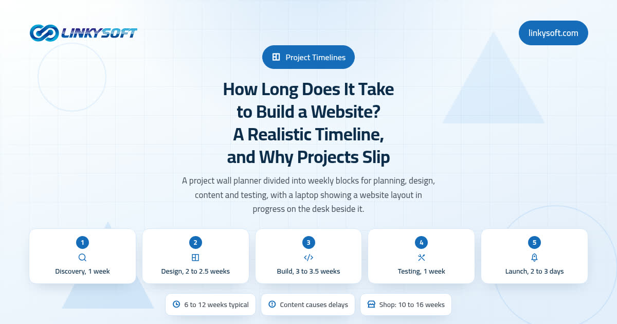
How Long Does It Take to Build a Website? A Realistic Timeline, and Why Projects Slip

Most timeline articles hand you a range and stop there. This one shows you where every week of a website project actually goes, names the four things behind almost every delay, and puts a cost in days on each of them. Read it before you sign anything, because it will tell you whether the date you have been quoted is a real plan or a hopeful one.

1 分で読めます

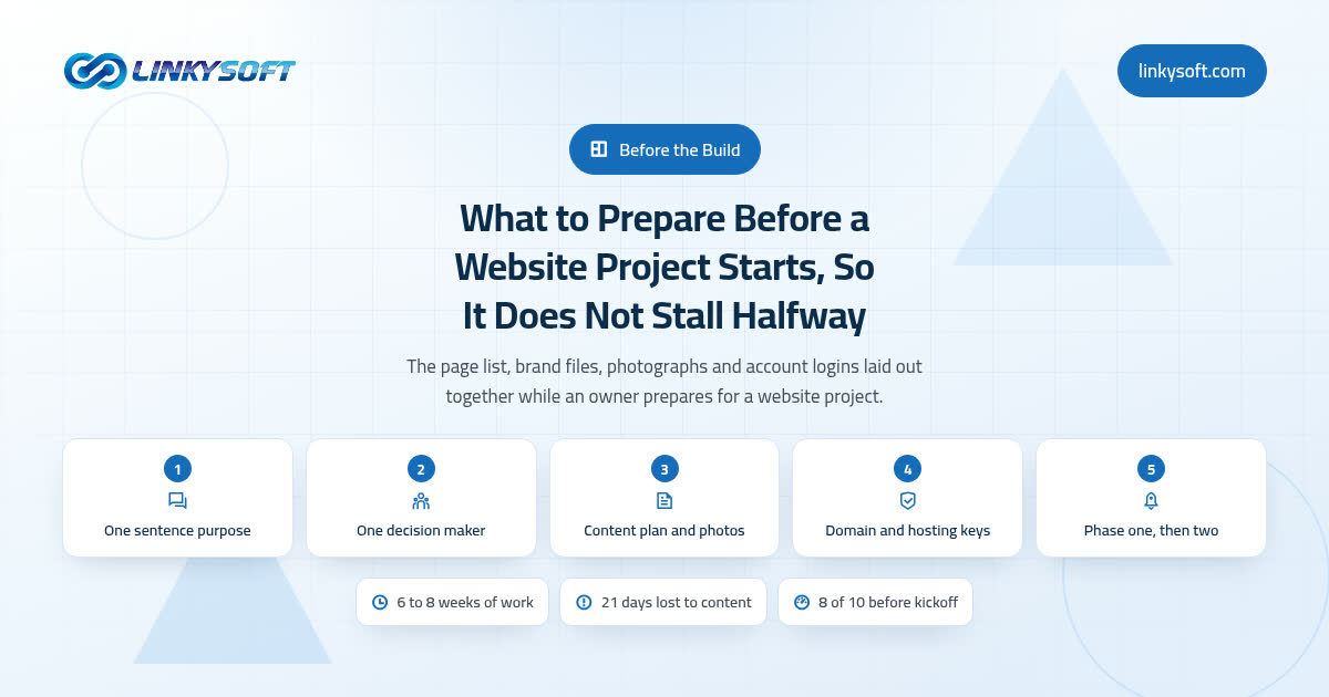
What to Prepare Before a Website Project Starts, So It Does Not Stall Halfway

The build work inside a small business website comes to 6 to 8 weeks, yet a troubled project shows 4 or 5 months on the calendar, and nearly all of that gap is waiting rather than working. This guide puts a price in working days on every missing item, from text that never arrives to a domain login nobody can find, and ends with the ten question checklist worth finishing before anyone quotes you a date.

1 分で読めます