What a one page site and a multi page site actually are
A one page site puts the whole business on a single long page. The menu across the top still looks like an ordinary menu, but nothing new loads when you click it; it simply slides you down to the right part of the same page, so About, Services and Contact are three stops on one scroll rather than three separate screens. A multi page site does the opposite and gives each topic its own address, so yourclinic.com/dental-implants is a page in its own right, with its own text, its own photographs and its own place in a search engine's list.
Two businesses will keep coming back through this article, because almost every owner who asks us this question turns out to be one of them. The first is a dental clinic offering five treatments, implants, braces, whitening, root canals and children's dentistry, each of which somebody types into a search box by name. The second is a coffee roaster who sells one thing, a monthly subscription for freshly roasted beans, to people who found him on Instagram. Same city, similar budget, and two completely different right answers.
Before we go any further, one myth is worth killing early, because it costs people money in both directions. A one page site is not the cheap, temporary or amateur option, and a site with twenty pages is not automatically the serious one. Shape is a question of fit, in the same way a shop chooses between one open room and several rooms: the jeweller with a single counter does not need corridors, and the department store would be chaos without them. Neither is the lesser shop.
There is also a third shape, and it is the one most businesses land on, so you do not need to pick a side while you read. It is a strong home page that tells the whole story in one scroll, plus a small number of real pages behind it for the things that genuinely deserve their own address. We come to it properly later, along with a short test for deciding which things those are.
The question that decides it is how many different visitors you get
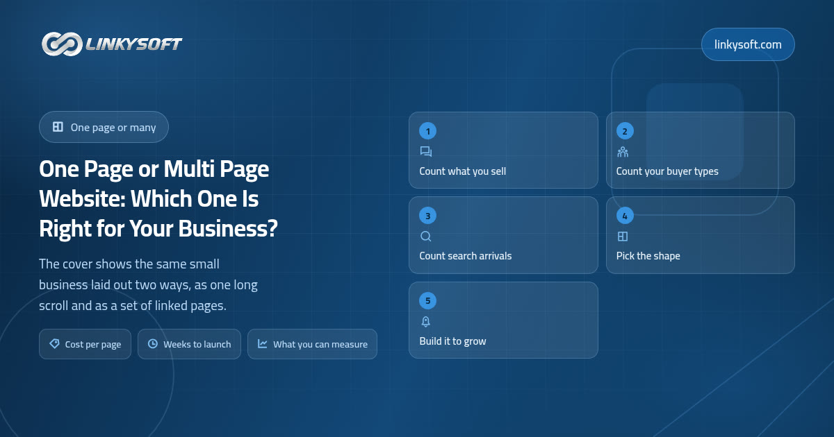
The shape of a website follows the number of distinct jobs it has to do, not the taste of the designer and not the size of the budget. That reads as obvious once it is written down, and yet most of the arguments we get asked to settle are really arguments about style, when the answer is sitting quietly in three counts the owner can make in about two minutes.
Count one: how many things do you sell that a customer would ask for by name? Not the categories you invented, but the words a real person actually uses, so dental implants counts and patient centred care does not. Count two: how many different types of buyer arrive? A clinic often has two, the patient and the dentist who refers patients across, and they want completely different things from the same website. A food producer may have retail buyers and wholesale buyers, who need different prices, different quantities and different reassurance. Count three: how many of those people would type a specific phrase into a search box, rather than arriving because they already know your name from a friend, a printed card or your Instagram?
The working rule we use in a first call is short, and it has held up across a lot of projects: once a visitor arrives with more than three genuinely different questions, a single page starts hiding the business instead of showing it. Every subject has to be squeezed down to fit the scroll, so the treatment that pays your rent gets the same two lines as the one you barely offer, and the reader leaves without the one answer they came for.
Write your three numbers down on a piece of paper now, because the rest of this article turns them into a decision, and the arithmetic is far less convincing if you are guessing at them as you go.
When one page is genuinely the right buy
Some businesses should never be sold a big site, and the coffee roaster is the clearest case. One service or one product, a launch, an event, a campaign, a business under a year old that is still working out what it really sells, and any business whose customers arrive from Instagram, WhatsApp, a referral or a printed card rather than from a search engine: every one of those is served properly by a single well built page.
The reason a tight one pager often converts better for these businesses is not mysterious. There is no menu to lose anybody in, so the visitor either keeps scrolling towards the button or leaves, and everyone who reaches the bottom has read your argument in the order you wanted it read. What we see in practice is 2 to 5 percent of visitors taking the main action on a focused one pager, against 1 to 3 percent on a multi page site that is trying to serve everybody at once. That is what we observe rather than a law of nature, and your own figures will move with your traffic and your offer.
There is also a pattern in what people are looking for when they land on a small service site, and it explains why the single page works so often. Based on the behaviour we watch, roughly 40 percent want to know what you do and what it costs, 25 percent want your contact details and your location, 20 percent want proof such as reviews and past work, and 15 percent want to know who you are. Three of those four sit comfortably one after another on a single page, which is exactly why a one pager satisfies so many small businesses without anybody feeling short changed.
So here is the uncomfortable part, said plainly: if this is you, do not let anybody sell you twelve pages. The difference in budget does far more good spent on photographs that make the product look like it tastes, on a phone number that a human being actually answers, and on the advertising that brings people to the page in the first place. A beautiful twelve page site with nobody on it is the most expensive object in web design.
Speed of getting live matters here too, because these businesses usually have a date in the diary. From a signed brief, meaning the short written agreement that sets out what the site has to say and do, to a live one page site is typically 1 to 3 weeks, and when it slips, it is almost never the code that slipped. It is the photographs and the text arriving late, which is worth knowing before you promise a launch date to anybody else. The part where we are designing and building the page itself is the part that can be compressed; the part where somebody in your office writes the words is the part that decides the date.
When many pages pay for themselves
The clinic is the other case, and its signals are just as clear. More than three services that people search for by name, more than one audience, more than one location, active hiring, published prices, and any real intention to write articles regularly: each of those is a reason some piece of your business needs its own address.
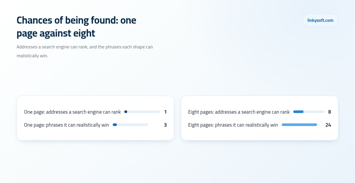
The search arithmetic is worth following slowly, because it is the part clients most often take on trust and then quietly misunderstand. A search engine keeps a list of addresses, and it ranks addresses rather than businesses. One page is one address, and realistically it competes for one main phrase plus two or three close variants of it, so call that three or four chances in total. Eight honest pages hand the search engine eight addresses, and a well written service page can carry two to four phrases of its own, which comes to somewhere between 16 and 32 chances instead of three or four. None of that requires a trick, it is simply arithmetic you can check yourself.
The second reason is the one clients feel much faster than they feel rankings, and it is having a page you can send. When a customer asks about braces, when a supplier wants your delivery terms, when a journalist wants the story behind the business, you hand over one link that is only about that thing, with nothing else on the screen competing for attention. On a one pager the best you can do is send the whole site and ask them to scroll, which is a small indignity that costs you more often than you would think.
Worked through the clinic it looks like this. Five treatments, five pages, five sets of real questions answered properly: what it costs, how long it takes, whether it hurts, what the recovery is like, and who performed the last hundred of them. Against that, one page where each treatment gets two lines and a photograph, so none of the five convinces anybody, because the person considering implants arrived with eleven questions and left with none of them answered. The five page version also tells you which treatment people actually read about, which is a point we come back to near the end.
How search engines read each shape, in plain terms
Strip the jargon away and a search engine behaves like a librarian with an enormous card index. It keeps a list of addresses, visits each one, and decides what that address is mainly about, in the same way a librarian shelves a book under one heading rather than five. A book about both plumbing and poetry is a problem for the librarian, and a page about five unrelated treatments is exactly the same problem.
The common fear is worth correcting directly, because it gets oversold by people selling bigger sites. A one page site is not banned, not penalised and not invisible, and it can rank perfectly well. It can just rank well for one thing, so the real question is never whether you can be found; it is how many different things you need to be found for. If the honest answer is one, then a single page is not a compromise at all.
Cramming five subjects onto one page weakens all five for a reason that has nothing to do with algorithms. The page cannot be clearly about any one of them, and worse than that, the six hundred words that would have convinced somebody about treatment three get cut down to sixty so the scroll stays bearable. You lose the ranking and the persuasion in the same edit.
If you are staying on one page, there are fixes that genuinely help you get found, and they cost far less than extra pages: one sharp page title that names the thing you sell and the town you sell it in, a complete business profile on the map listing with correct opening hours and real photographs, reviews collected steadily rather than in one suspicious burst, and the name of your town or district written into the text where it belongs naturally. We take these apart at greater length in our writing on how search really works, and none of it needs a technical background. When being found for free is slower than your cash flow can wait for, paying to be found is the other lever, which is a separate piece of work with its own numbers, and it is the sort of thing our digital marketing team will cost out honestly before you commit anything.
Speed, phones and the long scroll
One page carries a hidden cost that only shows up on a phone, and it is why some genuinely beautiful one pagers perform badly. Everything loads at once, every photograph, every video and every small piece of program code that drives an animation or a slideshow, all of it before the visitor has decided whether to look at any of it, because the page has no way of knowing that this particular person only cares about section four.
The numbers are worth translating out of megabytes and into waiting. A one page site with six full width photographs commonly lands at 4 to 7 MB, against 0.8 to 1.5 MB for a lean multi page home page. On a normal phone connection that is roughly the difference between a page that is ready before you look back down at the screen, in about 1.5 to 2.5 seconds, and one you sit through for 6 to 9 seconds. Visitors leave during that wait, and none of them write to tell you why.
If you still want one page, and plenty of businesses genuinely should, the fixes are straightforward enough to put in a brief. Compress the images before they go anywhere near the site, load photographs only as the reader scrolls down to them rather than all at once, cap the page at about six sections, and cut the background video, which is nearly always the heaviest thing on the page and nearly never the thing that sells.
Scroll depth deserves the same honesty. A one page site works comfortably at three to eight sections and roughly 800 to 1,500 words in total, and past about ten sections and 2,000 words the scroll gets long enough that, in the visitor recordings we watch, only a small share of readers ever reach the last two sections. That means the order of your sections is the whole design, so anything sitting below section eight is decoration rather than selling. The instruction you can act on today, even on a site you already own, is to place your main call to action twice: once near the top for the person who has already decided, and again in the middle for the person you have just convinced. Never only at the end.
What each shape costs, and where the money actually goes
We do not put prices in articles, because a price without a brief is a guess dressed up as a number, but the relationship between the two shapes is stable enough to plan with. A site of eight to ten pages generally lands at 2.5 to 4 times a comparable one pager, and the reason is not that the bigger site has more files on a server. Every page needs its own layout decisions, its own words, its own images and its own testing on a phone, a tablet and a desktop, and none of that gets copied across for free.
Here is the arithmetic in units of budget, so you can price your own idea before anybody sends you a proposal. Call the one pager 1 unit. Pages two to five add roughly 0.3 of a unit each, because each of them still has to be thought about from scratch. Pages beyond the fifth add about 0.2 each, as the patterns repeat and the designer stops inventing. A six page site therefore works out at about 1 plus four lots of 0.3 plus 0.2, which is 2.4 units, and that is close to what a real quote for one looks like.
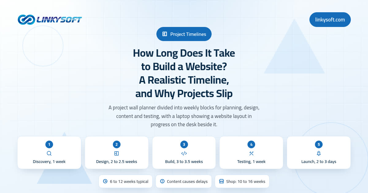
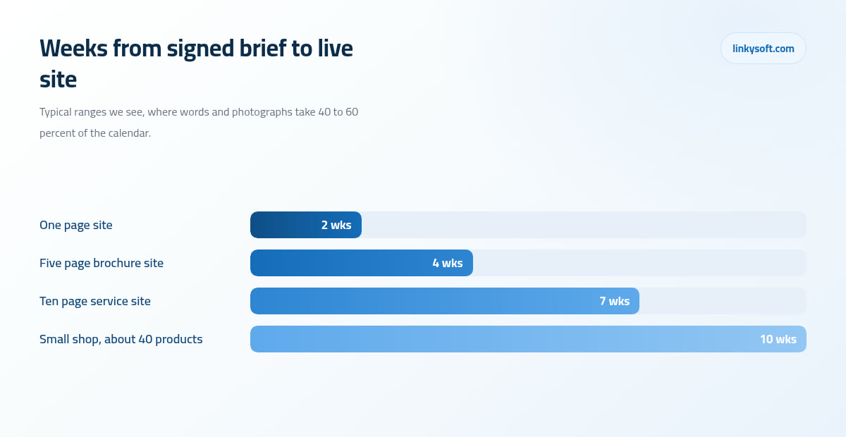
Time behaves the same way. From a signed brief to a live site, what we see in practice is 1 to 3 weeks for a one page site, 3 to 5 weeks for a five page brochure site, 6 to 8 weeks for a ten page service site, and 9 to 12 weeks for a small shop of around 40 products. The bottleneck is not the building, because writing the text and gathering the photographs is usually 40 to 60 percent of the calendar, and that is the part most clients leave out of the sum when they set themselves a launch date. The best thing you can do for your own launch date is start writing before the design begins.
Then there is the cost that most quotes leave out completely, which is keeping the thing alive after launch. A one pager needs about 1 to 2 hours a month to stay current, a ten page site needs 3 to 6 hours, and each published article adds 4 to 8 hours once you count the writing, the images and somebody reading it properly before it goes out. Publishing weekly therefore costs 16 to 32 hours a month on the articles alone, and with the upkeep on top that comes to roughly 19 to 38 hours a month, or about one working day a week for somebody in your office, so put it in the plan rather than abandoning the blog in month three with two posts on it.
The shape most businesses actually need
The hybrid is the honest recommendation more often than either extreme, so it deserves describing properly rather than as a fudge between two positions. You build a home page that works exactly like a one pager, telling the whole story in a single scroll from what you do to how to reach you, and then you put four to eight pages behind it for the things that deserve their own address. Most visitors read the home page and stop there, which is fine, because it was written to work on its own.
The pages that earn their place are fairly predictable: one page for each service with real demand, a contact page with a map and opening hours, proof of past work with the actual result written down rather than implied, and a prices page if you are willing to publish prices. That is usually four to eight pages, and each of them does a job that could not have been done inside another page.
The pages that do not earn their place are just as predictable, and this is where budgets quietly disappear: a vision statement nobody has ever read to the end, a gallery of photographs with no words around them, a news section that will not be touched after month two, and a separate page for each member of a three person team. None of those brings in a visitor or answers a question, so they cost you twice, once to build and once to keep.
The test for whether a page should exist at all is three questions long, and a single yes is enough to justify it. Would somebody search for this on its own? Would somebody link to it? Would you ever need to send it to one person by itself? If all three answers are no, that content belongs inside another page as a section, where it will do just as much good for considerably less money. Proof is the interesting case here, because it usually passes all three: people do search for evidence before they buy, and a page of real projects with real outcomes is one of the few pages a stranger will read all the way to the bottom.
What a one page site quietly hides from you
Measurement is the cost nobody mentions at the quote stage, and it is the one that catches owners out about a year in. On a one page site, 100 percent of your visits are recorded as the home page, so your statistics can tell you that four hundred people came and almost nothing else. You cannot see which service pulled them in, and you cannot see which one nobody bothered scrolling to, so the thing you most need to know is precisely the thing the site never records.
The same traffic on a multi page site splits into per page figures you can read after about a month, and that is the point where a website starts paying you back in decisions rather than in visits. You find out that the treatment you assumed was your bread and butter gets a tenth of the readers, while the one you nearly dropped brings in a third of them, so you stop paying to promote the wrong thing. That is not a technical benefit, it is a commercial one, and it compounds every month you keep looking.
Advertising makes the difference sharper still. Three ad campaigns pointing at one page give you one blurred result, because every click lands in the same place and no report can tell the three apart. Three landing pages, meaning three separate pages that each exist to catch the clicks from one advert and nothing else, give you three clean results, so once the first month of figures is in you can move the whole budget onto the winner instead of splitting it three ways out of politeness to your own guesses.
None of this is a reason to panic if you are the coffee roaster. If you never intend to spend on advertising, and you will judge the site by whether the phone rings and the orders arrive, then this is a cost you can accept quite happily, and you should. It only turns expensive at the moment you decide to spend real money attracting more visitors and need to know which of them were worth the money.
Five questions that settle it in ten minutes
Answer these five with a plain yes or no, honestly, about the business you have today rather than the one you hope to have in three years.
- Do you sell more than three things that a customer would search for by name?
- Would a customer, a supplier or a journalist ever need a link to one specific thing on its own?
- Will you publish something regularly, meaning articles, projects or news, at least once a month?
- Do you need strangers to find you through a search engine, rather than through referrals and social media?
- Will you spend money on advertising within the next year?
The scoring is deliberately blunt. Zero or one yes points to a one page site, and you should stop reading and go and sort out your photographs instead. Two or three yeses point to the hybrid, meaning a strong home page with four to eight pages behind it. Four or five point to a proper multi page site, and at that level the extra cost usually pays for itself inside the first year through search alone.
What we see in practice is that most small local businesses land squarely in the middle on two or three yeses, which is why the hybrid is the most common honest recommendation we give. It is also the hardest one to sell, because it is neither the cheapest option in the room nor the biggest invoice.
If you are stuck exactly between two answers, use the tie breaker: choose the smaller shape and spend the saved budget on better photographs and better text. Both of those improve either shape, they carry over completely if you grow into the larger one later, and neither of them becomes waste on the day you change your mind about the structure.
Start small, but start on ground you can build on
Starting small is fine. Starting on ground you cannot build on is what turns a sensible first site into a rebuild, so this is the section to read twice if your budget says one page today.
The numbers go like this. Turning a one pager into a real multi page site later typically costs 60 to 80 percent of what building the multi page site from scratch would have cost, and the reason is not technical stubbornness. The words have to be written properly rather than cut and pasted across, because two lines about implants on a one pager are not a page about implants, and everybody discovers that at the worst possible moment.
Built on a system that already supports pages, the same move lands nearer 30 to 40 percent, which is the difference between an upgrade and a rebuild. Nothing exotic is needed for that; the site simply has to be able to add page number two without anybody rewriting the foundation underneath it.
So when you buy any small site, insist on four things and get them in writing.
- Your domain name, which is the address people type in to reach you, and your hosting, which is the rented space on a computer somewhere that keeps the site switched on day and night, both registered in your own name rather than the agency's.
- Text you can edit yourself without sending an email and waiting two days.
- An address structure that can take new pages later, so that adding /dental-implants does not break the menu.
- The design files handed over at the end, so the next person can carry on instead of starting again.
The warning attached to all that is specific: locked builders and one page templates that physically cannot take a second page. They look like a bargain in month one, and they are exactly where the rebuild bill comes from in year two, because the only way forward is to leave and start over. At Linkysoft we build one page sites on the same foundation as the large ones, so page two costs what a page ought to cost rather than costing a new website. And if what you actually need is not more pages at all but a booking system, a customer portal or an ordering system, that is a different question with different economics, closer to a web application or to a mobile app than to a brochure, so it is worth separating the two before you brief anybody.
On a first call we ask for the three counts from earlier: how many things you sell that people name, how many different types of buyer you get, and how many of them find you through search. Those three numbers usually produce the answer within ten minutes, and we say openly that we recommend the smaller option often, because a one page site that is right beats a ten page site that only half exists. If you want that conversation, our contact page is the place to start, and if you would rather decide on your own, the rest of the Linkysoft blog takes the neighbouring questions apart in the same way. Either of those is a good outcome as far as we are concerned.