There is a particular kind of quiet that follows a website launch. The new site goes live, the photographs look lovely, a few customers and a supplier tell you it looks great, and then the enquiry inbox carries on doing more or less what it did before. Nobody is lying to you when they say it looks good, because it probably does look good. The question people bring to us is usually the blunt version of that disappointment: why is my website not getting enquiries when it looks better than anything my competitors have?
Why a good looking website can still leave the phone silent
Looking good and being easy to act on are two different jobs, and only one of them pays the wages. So before anything else, let us agree on what we are counting. An enquiry is any message where a stranger asks you to do something for money: a form filled in, a phone call, a WhatsApp message, a booking taken, a request for a quote. It is not a visit, not a follower and not a compliment, because none of those has ever settled an invoice. It is the moment somebody puts their name in front of you and waits for an answer.
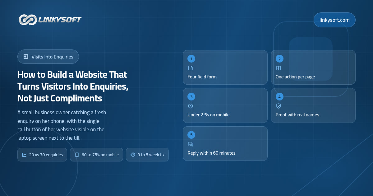
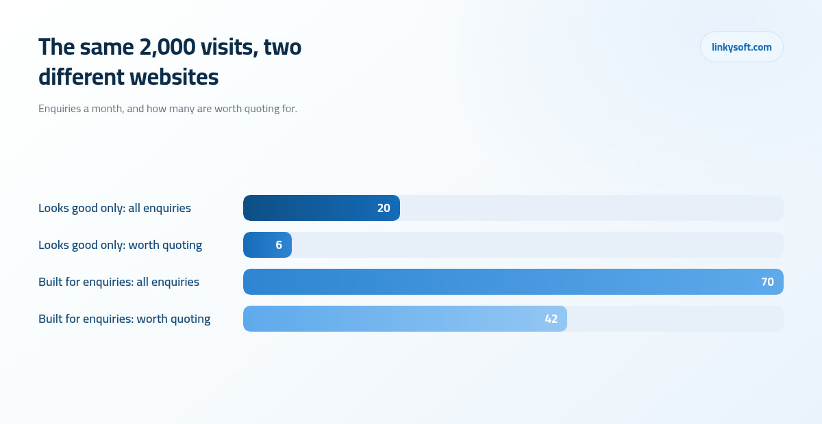
Now the arithmetic, which is where the silence usually comes from. Suppose your site receives 2,000 visits a month, an ordinary figure for an established local business. An attractive site with no obvious next step turns roughly 0.5 to 1.5 percent of those visitors into an enquiry, so at about 1 percent you are looking at 20 enquiries. A site built around one clear action normally runs at 2 to 5 percent, so at about 3.5 percent those very same 2,000 visits produce something like 70. Same town, same traffic, same advertising spend, three and a half times as much work walking through the door.
That gap is not a matter of taste, and closing it is not a design problem in the way most owners imagine. Nothing in the rest of this article needs a designer's eye or a line of code from you, because it needs decisions you are already qualified to make about what you sell, who you sell it to, and what a stranger should do in the first eight seconds. At Linkysoft we work through these in a fixed order, since some of them move the number far more than others, and we would rather you spent your money on the first three than on all five at once.
Work out what one enquiry is worth before you change a single pixel
Every sensible decision about your website comes out of three numbers, and you can find all three in an afternoon without any special tools or anyone's help:
- Visits a month. Your analytics dashboard, or your hosting statistics if you have nothing else installed.
- Enquiries a month. Count the ones you can see: form emails, calls that came because of the site, WhatsApp messages, booking requests. A rough count from the last three months is fine.
- The share that become paying customers. Ask whoever answers the phone, because most owners already know this to within a quarter.
Take a firm we might easily be describing, a plumbing company or a dental practice or a cabinet maker. Forty enquiries a month, one in four turns into a customer, average job about 900 in whatever currency you work in. That is ten customers, so the website is quietly carrying roughly 9,000 a month, which is about 108,000 a year that most owners have never written down anywhere.
Then comes the number that decides whether any of this work is worth doing. Move that site from 2 percent to 3 percent on 2,000 visits and you have added about 20 enquiries a month, which at one in four becomes about 5 more customers, which is about 4,500 a month. One percentage point. That is what makes a three week piece of work obviously sensible, and it is also what tells you when the same work would be silly, because if your site brings 80 visits a month then a percentage point is worth less than one enquiry and none of this matters yet.
Which brings up the one honest exception. If the site is getting 80 visits a month, the problem is not your buttons or your form, it is that nobody is arriving in the first place, and no amount of page surgery fixes an empty room. That reader should stop here and start with getting found by the people who are already searching, then come back once there is traffic worth converting.
One more distinction, because total enquiries is a flattering number and quality is the one that costs you time. From a vague site that never says who it is for, roughly 3 in 10 enquiries are worth quoting for, and the rest are price fishers, wrong region, wrong service, or somebody who wanted a different trade entirely. From a site that names its customer and gives a price range, it is closer to 6 in 10. So the 20 enquiries above give you about 6 useful conversations while the 70 give you about 42, which is a sevenfold difference in the thing that actually matters.
The five second question every page has to answer
People decide in about five to eight seconds whether a page is for them, and they do it before reading a word of your carefully written paragraph. In that time the top of the screen has to answer three questions: what is this, is it for me, and what do I do next. Miss any one of the three and the visitor leaves without ever finding out you were the right firm.
Consider two headlines. The first says Excellence Redefined, which describes every business on earth and commits to nothing. The second says Emergency boiler repairs across Manchester, engineer at your door the same day, which tells a soaked homeowner at nine at night exactly whether to keep reading. The second wins every time, not because it is better writing but because it answers the question the visitor actually has, and if this is the part you want to work on we have more on writing a headline that says something.
Here is the practical checklist for the first screen on a phone, all of it visible before any scrolling happens:
- The service, named in the words a customer would use rather than your industry's words.
- The place you serve, because location is half the decision for most service businesses.
- One line of proof: years trading, jobs completed, a certification, or a review score with a real number behind it.
- One button, in a colour nothing else on the page uses.
- A phone number that dials when it is tapped, not a picture of a phone number.
This is also where rotating sliders quietly waste the best space you own. On the sites we audit, roughly 9 in 10 visitors only ever see the first slide, because the second one arrives after they have already scrolled or left. So a rotating banner takes the most valuable rectangle on your website and spends most of it showing content that almost nobody asked for, while the one message that matters gets a fraction of the attention it deserves. Pick the strongest single thing you do and leave it on the screen.
One page, one action, and a smaller second choice
The rule fits in a single line: every page gets one action you actually want, plus one lighter option for the people who are not ready yet.
Four buttons of the same size and colour amount to no button at all, because the visitor now has to choose and choosing is work. Faced with Book a Consultation, Learn More, Download Brochure and Contact Us all shouting at the same volume, most people resolve the problem by leaving. One button that clearly dominates removes the decision, and the lighter second option quietly catches everybody the first one was too much for.
Match that action to how people actually buy from you, since the right button is different in every trade:
- Emergency trades: a phone number, large, at the top, on every page, because nobody fills in a form while standing in water.
- Clinics and salons: a booking slot with real times, given that the whole appeal is not having to speak to anyone.
- A 40,000 project: a short form and a promise of a call back within a stated time, never a Buy Now, because nobody commits that on a Tuesday afternoon without a conversation.
- Products with a known price: a straight purchase, with the price visible before the click rather than after it.
The lighter second option deserves proper treatment rather than a grey link in a corner. Download the price guide, see the work, message us on WhatsApp, ask a question and we will answer it without quoting you: that is how you keep the roughly 90 percent of visitors who are still comparing three firms and have no intention of committing today. Lead generation website design for a small business really is mostly this, and building pages around a single action is the everyday work of our web design and development team. It is usually the cheapest change on the list too, because it costs decisions rather than development.
The enquiry form is where most websites quietly lose the money
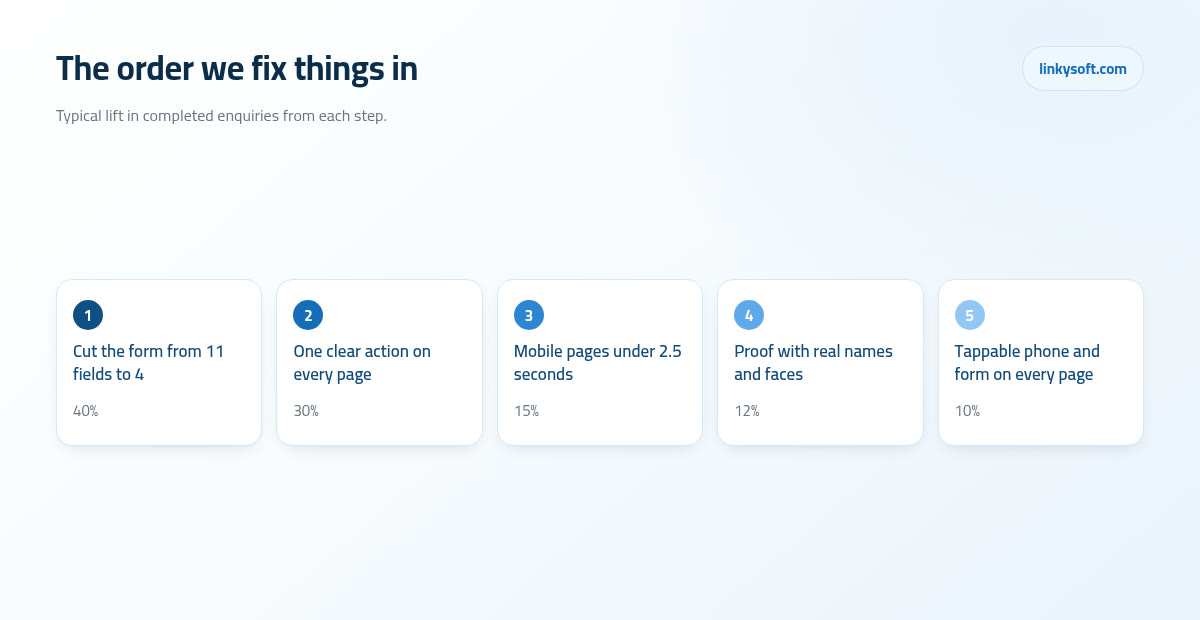
If you only act on one section of this article, make it this one. Cutting a form from 11 fields to 4 typically lifts completed submissions by 30 to 50 percent, and the four that survive are always the same: name, one way to reach you, one sentence about the job, and the time of day you would like to be contacted. Everything else can be asked in your reply, when the person is already talking to you.
The reason is arithmetic rather than psychology. Each extra required field costs somewhere around 3 to 7 percent of finished forms, so a company name box you never read and a postcode you will ask for again on the phone are not free, they carry a price and you have been paying it every month. Before you add a field, ask what you would do differently if you had that answer, and if the honest reply is nothing, it is costing you enquiries for no return at all.
The small mechanics that matter more than they should
- Labels sitting above the boxes and staying there, because placeholder text that vanishes as you type makes people forget what they were answering.
- Phone fields that bring up the number keypad on a phone, which sounds trivial until you watch somebody hunt for digits on a letter keyboard.
- Error messages that say what to fix and where, so "please add a phone number or an email so we can reply" rather than a red outline and silence.
- A send button that says Send my enquiry, because Submit is a word borrowed from tax forms and nobody enjoys submitting.
Spam is the usual objection to a short form and it deserves an honest answer. A hidden field that only a machine would fill in, together with a limit on how often the same visitor can send, catches most of what arrives at a small business site. A puzzle style challenge where visitors pick out traffic lights does block more spam, yet it also blocks real customers on slow connections and older phones, and on the forms we have measured it usually costs more genuine enquiries than the spam it saves you reading. If a site is genuinely under attack rather than mildly annoyed, that is a different problem and it belongs with people who work on security instead of with your contact page.
Finish by sending people to a real thank you page rather than a small green message under the button. A proper page can say what happens next and when, which settles somebody who has just handed a stranger their phone number, and it gives you a page that can be counted, so you finally know how many enquiries the site produced last month instead of guessing. That is about thirty minutes of work, which makes it the best value half hour in this whole article.
Proof a stranger will actually believe
Trusted by hundreds of happy customers is a claim, and a stranger has no reason to believe a word of it because you wrote it about yourself. Proof is a different object entirely: a named client, a number, a date and a photograph. The gap between the two is roughly the gap between a man telling you he is a good driver and a clean licence.
A believable line has a recognisable shape. "We cut invoice chasing from six hours a week to about forty minutes for a twelve person plumbing firm in Leeds, within three months" gives the reader something to picture, and it survives the silent question every visitor is asking, which is whether any of this applies to somebody like them. Set that against "improved efficiency for a client in the trades" and you can feel the difference immediately.
Most businesses already own far more proof than they use, so go and look for:
- Before and after photographs from real jobs, taken on a phone, slightly imperfect and much more convincing for it.
- The faces of the people who will actually turn up, with their first names.
- Reviews with detail in them, because "arrived when they said, cleaned up afterwards, price was exactly what they quoted" is worth twenty five star ratings with nothing written underneath.
- Certificates, trade memberships, insurance cover, years trading, and a map with a real address on it.
One warning attached to all of that. Stock photographs of models in hard hats who have never worked for you are recognised instantly, and they cost you trust on precisely the page where you can least afford to lose it. A slightly awkward photo of your own team beats a beautiful photo of somebody else's every single time. If you want a format worth copying, our case studies follow the same pattern, and the principle holds generally: two detailed stories a reader can follow will beat twenty client logos in a grey row.
Speed, phones and the things that quietly slow a site down
Aim to have something useful on the screen in under about 2.5 seconds, measured on a mid range phone using mobile data rather than on your office broadband. Beyond that point every extra second costs roughly 5 to 10 percent of the people still waiting, and none of them tell you they left. They simply return to the search results and try the next firm on the list.
The most common cause is one you could fix this weekend. A hero photograph straight out of a camera or a phone weighs around 4MB, while the same picture, sized to the space it actually occupies and compressed properly, comes in at about 220KB. That is roughly 18 times less data to download and often 1 to 3 seconds saved on a phone. Nobody can see the difference in quality and everybody can feel the difference in waiting.
The rest of the weight is usually a short and familiar list: a background video nobody watches, the slider we mentioned earlier, five font weights where two would do, a chat widget that loads a small application before it says hello, and plugins somebody installed three years ago for a campaign that ended long ago. Each one is defensible on its own, and together they are why your site takes six seconds to say anything at all.
All of this matters more than it used to, because 60 to 75 percent of visits to a local service business site now come from a phone, while almost every website gets reviewed on a laptop by people sitting comfortably at a desk. So tap targets of at least 44 pixels, a call button a thumb can reach without shifting grip, and text you can read without pinching are not small details. They are the actual experience most of your customers are having.
Should you put your prices on the site
There is no rule here, only a trade off, and once you see it as arithmetic the decision gets much easier. Publishing a from price or a range usually reduces the number of enquiries by around a fifth, while raising the share worth quoting from roughly 3 in 10 to roughly 6 in 10, because the people who were never going to afford you leave quietly instead of writing to you.
Work it through with real figures. Ninety enquiries where 3 in 10 are useful gives you 27 real opportunities and 63 conversations that go nowhere. Seventy enquiries where 6 in 10 are useful gives you 42 real opportunities and 28 wasted ones. Fewer enquiries in total, half as much again in genuine work, and considerably less of somebody's Tuesday spent explaining to a caller with a 500 budget why the job costs 4,000.
You can publish a number without being trapped by it, and there are four ways that work in practice:
- A from price, with one honest line about what pushes it upwards.
- Three tiers, where the useful part is not the prices at all but the description of what changes between them.
- A typical project range, along the lines of most kitchens we fit landing between one figure and another.
- A worked example of a real past job, with its final figure and a list of what was included.
There are also honest reasons to keep prices off the site: genuinely bespoke work where no two jobs resemble each other, regulated pricing you are not free to publish, or a market where a number without a survey would mislead people and you would spend the year correcting it. In those cases give something rather than nothing, such as a downloadable price guide explaining what drives the cost, which buys you much the same filtering effect. There is more in our writing on how to build a pricing page if this is the section you are stuck on.
Write for the worry, not for the award
People do not read websites, they scan them, hunting for the answer to a private worry they would rather not say out loud. Will this cost more than I have. Will they actually turn up. Will I look foolish for asking. So your subheadings should read like the questions in the visitor's head rather than like chapter titles, because a heading that says "what happens if something goes wrong after you leave" gets read, and one that says "our philosophy" does not.
The single swap that fixes most pages is replacing adjectives with specifics. Professional and reliable means nothing, since no business on earth describes itself as amateur and erratic. Same day callout, fixed price agreed before we start, twelve month guarantee on parts and labour: three specifics, all of them checkable, doing a job that a page of adjectives never could.
Write at the level of a busy person reading on a bus with one hand. Short sentences mixed with longer ones so it does not read like a machine, no industry vocabulary unless you explain it in the same breath, and paragraphs of two or three lines rather than blocks that have to be climbed.
Then build a questions section that removes fear instead of filling space. The questions worth answering are the awkward ones: how much roughly, how long will it take, who will actually come to my house, what happens if it goes wrong, and do I pay anything simply to ask. Answer those honestly and you have dealt with the objections your competitors leave sitting in the reader's head.
This is the part clients most often want to hand over, and it is the one part where we usually push back. The owner's own words, lightly edited, beat anything Linkysoft would write on their behalf, because you know exactly what customers ask you on the phone every week and no writer can invent that from the outside.
After the send button: replying fast and knowing what worked
Everything above exists to get somebody to press send, and at that moment the website's job ends and yours begins. Replying inside 60 minutes typically turns about twice as many enquiries into a real conversation as replying the next day, and the reason is competition rather than psychology: most people message three suppliers the same evening and hire the first one who gives them a sensible answer, so being second is often the same as being nowhere.
Making that possible is mostly plumbing rather than effort. Enquiries should land in two inboxes and on a phone rather than in one person's email while they are on holiday. An automatic acknowledgement should go out at once with a realistic time inside it, so "we answer enquiries within one working hour, Monday to Saturday" instead of "we will get back to you soon". And one named person owns that inbox on a Friday afternoon, because that is when the good jobs arrive and everybody assumes somebody else is watching.
You also need to know which of these changes worked, which means turning an enquiry into a counted event with its source recorded, so you can see that 12 came from search, 5 from the map listing and 3 from the advert you are paying for. That is typically half a day to two days of work and it is the cheapest item on this entire list by a distance, because without it every argument about the website is a matter of opinion and the loudest voice wins.
Being honest about testing matters here too. You need roughly 200 to 400 visits and at least 25 to 30 enquiries per version before a difference between two pages means anything, and below that you are reading noise and making confident decisions from it. So if your site sees under about 3,000 visits a month, fix the obvious problems in the order given here and leave split testing to sites with the traffic to support it.
Eventually the enquiries outgrow an inbox, and you can tell because things start getting missed and nobody can say who spoke to whom. That is the point where a small booking system or a simple customer record, the sort of thing we build as a web application, saves more time than another marketing campaign would. It is also where an automatic first reply that answers the common questions at two in the morning starts to earn its keep, which is one of the few honest uses of an AI assistant in a small business, once the volume is real rather than hoped for.
What it costs, how long it takes, and when the smaller option is right
Two routes, honestly described, with the cost and timeline of a business website redesign as we actually quote it.
Rewriting the five pages that already carry the traffic
Rebuilding the five pages that already receive most of your visits, usually the homepage, two service pages, the about page and the contact page, typically takes 3 to 5 weeks and costs roughly 15 to 30 percent of a full rebuild. You keep your platform, your hosting and whatever search ranking you have earned over the years, and the effort goes entirely into the pages that were always doing the selling.
Building the whole site around enquiries
A full 8 to 12 page site designed around enquiries from the first sketch typically takes 6 to 10 weeks including writing the content, and the content is the part that slips, because it needs the owner's time and the owner is busy running a business.
The smaller option is right far more often than our industry admits. If your site is under two years old, has a sensible structure and a real source of traffic arriving, then it needs surgery rather than a funeral, and we will say so before quoting rather than afterwards. A rebuild becomes the cheaper answer when the platform is old enough that nobody can edit it without breaking something, when there is no mobile layout worth the name, or when three seconds pass before anything appears on the screen, because at that point you are paying to redecorate a house with subsidence.
For the reader who is never going to hire anybody, here is the free weekend version in the order to do it:
- Cut the enquiry form down to four fields.
- Put a tappable phone number at the top of every page.
- Compress the five heaviest images on the site.
- Rewrite the homepage headline so it names the service and the place.
- Add one real customer story with a name, a number and a date in it.
That list, done properly, will improve the website conversion rate of most small sites and it costs nothing but a Saturday. When the list runs longer than a weekend, or the site fights back every time you touch it, that is the moment to bring in a team, and Linkysoft does this work for owners in exactly the position described here. If you would like a straight answer rather than a proposal, send your site address, your visits and enquiries for the last three months, and what a typical job is worth to you through the contact page, and we will tell you which of the two routes we would choose and why, including the times when the answer is that you do not need us yet. If you would rather keep reading first, there is more across the rest of our writing on turning visits into work.